Mobile Readiness
CoRA has been designed as a web responsive application which is mobile ready from the get go. This means you can serve your project needs with confidence – the underlying layout, screens, widgets, styles and user interface automatically adapts to perfectly fit the available screen real estate, no matter the type or size of the viewing device. CoRA allows users to access the application and use the full range of features with responsiveness, flexibility, and extensibility.
– CoRA works where you are, on any device
What devices does CoRA support?
CoRA Works on all devices
Device Sizes
| Device | Size | Screen size |
|---|---|---|
| Mobile | Small | 320px |
| Mobile | Medium | 375px |
| Mobile | Large | 425px |
| Tablet | 786px | |
| Laptop | Small | 1024px |
| Laptop | Large | 1440px |
Tip
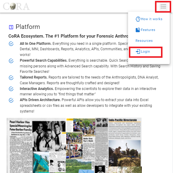
For smartphones & tablet sizes and under, the top right side navbar will be displayed as a condensed hamburger menu
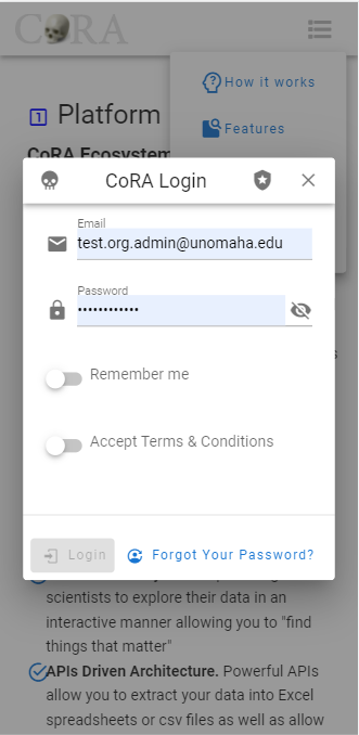
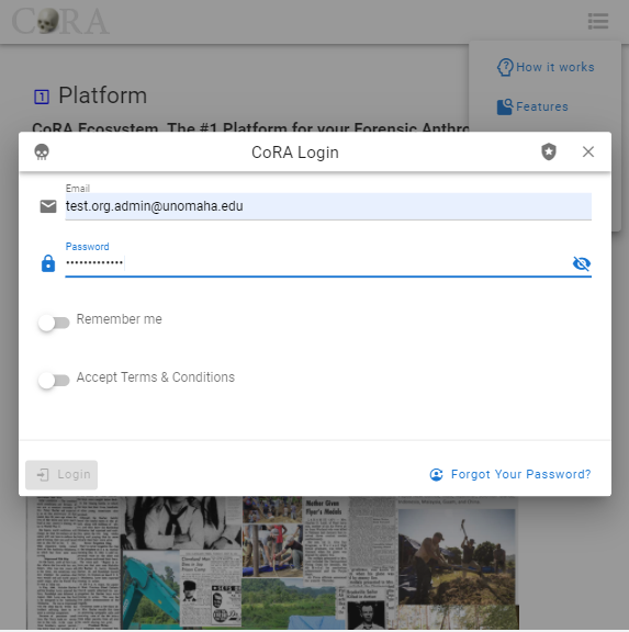
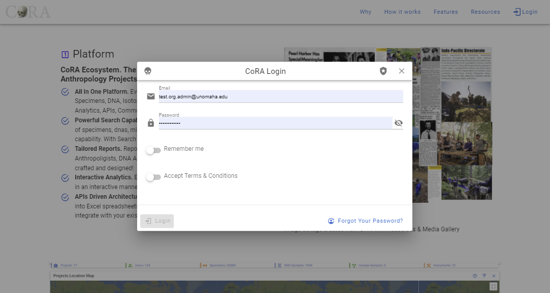
Login
- Mobile - 320px, 375px and 425px

- Tablet - 768px
- Laptop - 1024px
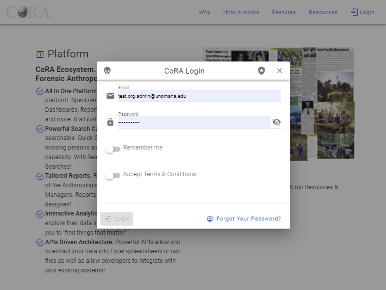
- Large Laptop - 1440px
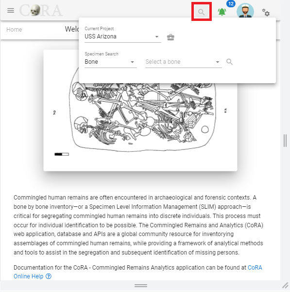
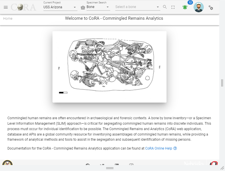
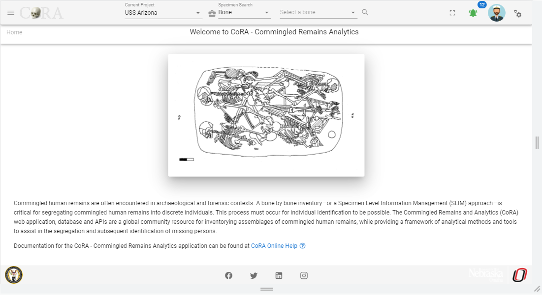
Dashboard
- Mobile - 320px, 375px and 425px
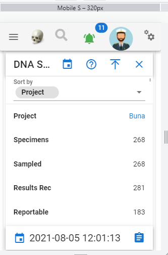
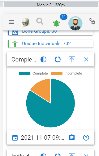
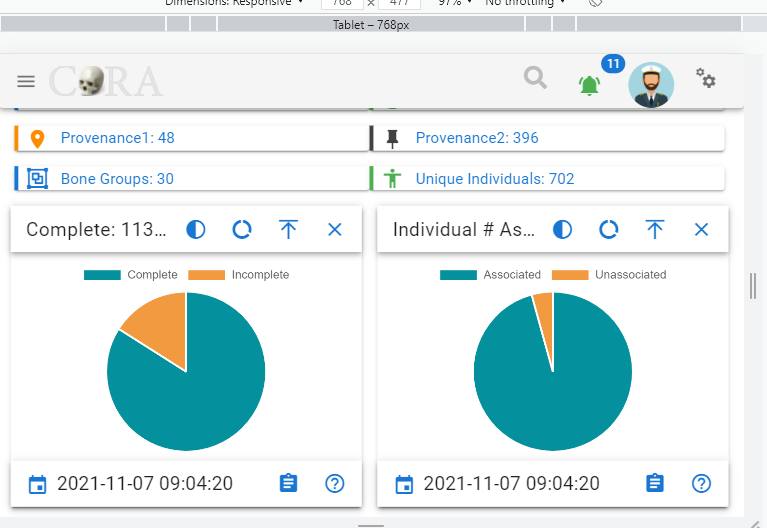
- Tablet - 768px
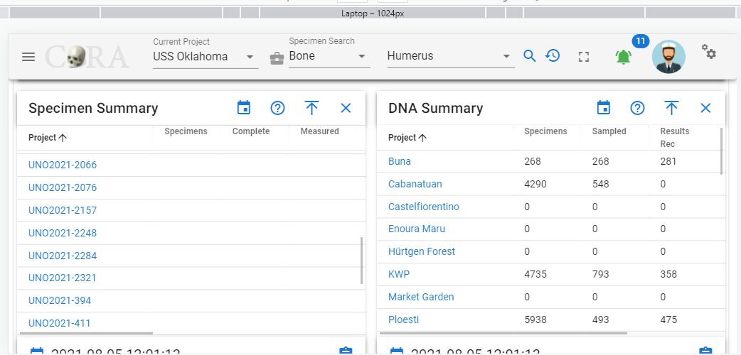
- Laptop - 1024px
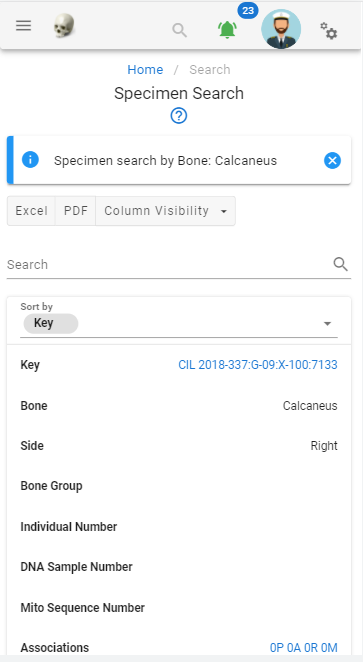
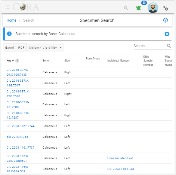
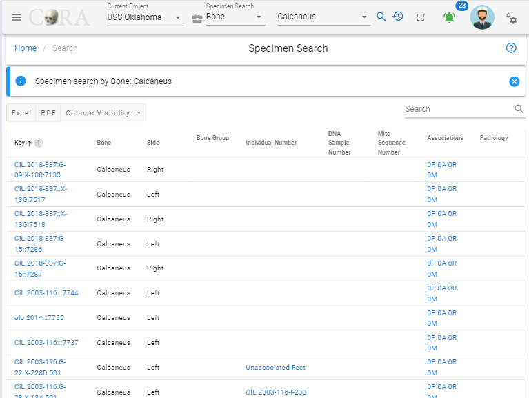
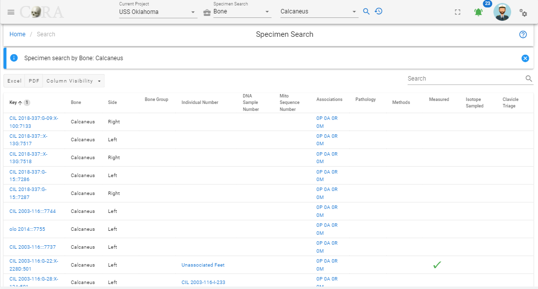
Search
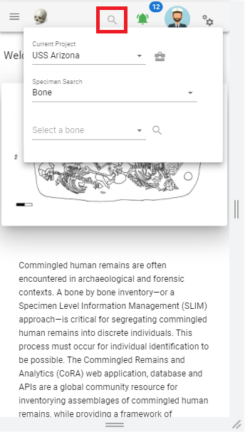
- Mobile - 320px, 375px and 425px
- Tablet - 768px
- Laptop - 1024px
- Large Laptop - 1440px
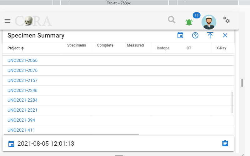
Specimens
- Mobile - 320px, 375px and 425px
- Tablet - 768px
- Laptop - 1024px
- Large Laptop - 1440px
Last update:
2023-12-29
Created: 2023-12-24
Created: 2023-12-24